Docs UI kit#
The docs site is Material for MkDocs with a small design system on top. This page shows every token and component, and doubles as a visual test: if something here looks wrong, the site does too.
Note
This page is written for the docs site. On github.com the components below render as plain HTML.
How it fits together#
| Layer | File | What it does |
|---|---|---|
| Tokens | docs/stylesheets/tokens.css |
Every color, radius, shadow and spacing value, for light and dark, mapped onto Material's variables |
| Components | docs/stylesheets/components.css |
Chrome, typography, code, tables, callouts and the sg-* components below. Reads only tokens |
| Landing page | overrides/home.html |
Hero, feature cards and workflow steps, above the README-generated body |
| Build hooks | hooks/sg_hooks.py |
Turns GitHub alerts into callouts, and README <picture> diagrams into images that follow the color toggle |
| Generated pages | scripts/sync-docs.py |
Builds index.md and commands.md from README.md |
Rules of thumb:
- Write GitHub-flavored Markdown. Pages must read well on github.com too. Use GitHub alerts and
<picture>for themed images; the hooks translate them. - Components only read tokens. Never hard-code a color in a component; add a token for both schemes instead.
- Light and dark ship together. Check both with the toggle in the header before merging.
Tokens#
Colors are defined twice, for default (light) and slate (dark), and switch with the toggle. Each chip below is painted with the live token.
Shape and space use a fixed scale: radii --sg-radius-sm (6px), --sg-radius (10px), --sg-radius-lg (16px) and --sg-radius-pill; spacing --sg-space-1 to --sg-space-8 (0.25rem to 4.5rem); shadows --sg-shadow-1 to --sg-shadow-3.
Typography#
Inter for text, JetBrains Mono for code, both loaded by Material. Headings are tight-tracked and bold; h2 starts a section with a hairline rule.
This is an h3#
Body text runs at a comfortable measure with strong emphasis, inline code and links that underline subtly and darken on hover.
Buttons#
[Primary action](page.md){ .md-button .md-button--primary }
[Secondary action](page.md){ .md-button }
Callouts#
Write GitHub alerts; the build turns them into callouts.
Note
Context worth knowing before you continue.
Tip
shopgen doctor checks everything a run needs without writing anything.
Important
Secrets are read only from the environment.
Warning
Dev stores allow 5 creates per minute; a 90-day profile takes about 19 hours.
Caution
Never point shopgen at a store with real customers.
Cards#
<div class="sg-grid" markdown>
<div class="sg-card" markdown>
<span class="sg-card__icon">:material-broom:</span>
<h3 class="sg-card__title">Clean up</h3>
<p>Purge removes only what shopgen tagged.</p>
</div>
</div>
Steps#
Check
Credentials, scopes and catalog.
shopgen doctorPreview
Volume, revenue and run time.
shopgen planCreate
Smoke test, then the full history.
shopgen run
Outcome pills#
The seven order outcomes have fixed colors, shared with the CLI and the diagrams.
fulfilled unfulfilled partially_fulfilled pending_payment refunded partially_refunded cancelled
Terminal#
For transcripts that should look like a terminal in both themes.
Tables and code#
| Flag | Default | |
|---|---|---|
--limit |
0 |
Stop after N successful creates |
--opm |
5 |
Orders per minute |
Themed images#
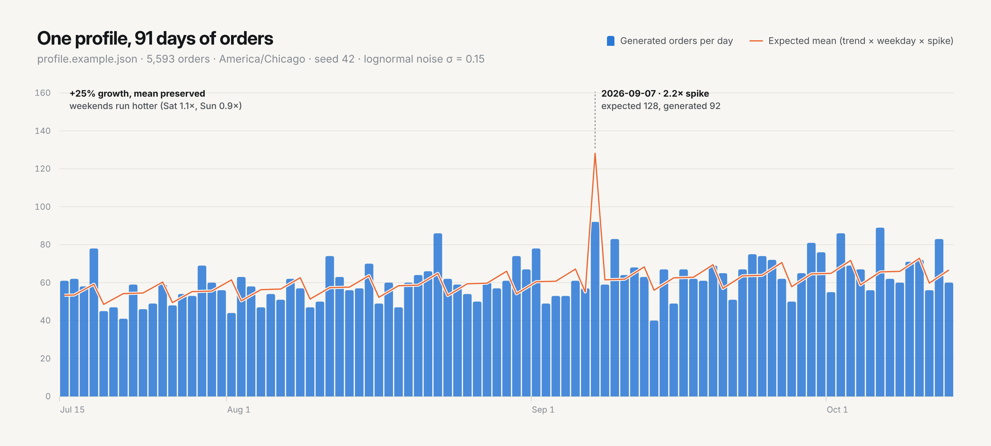
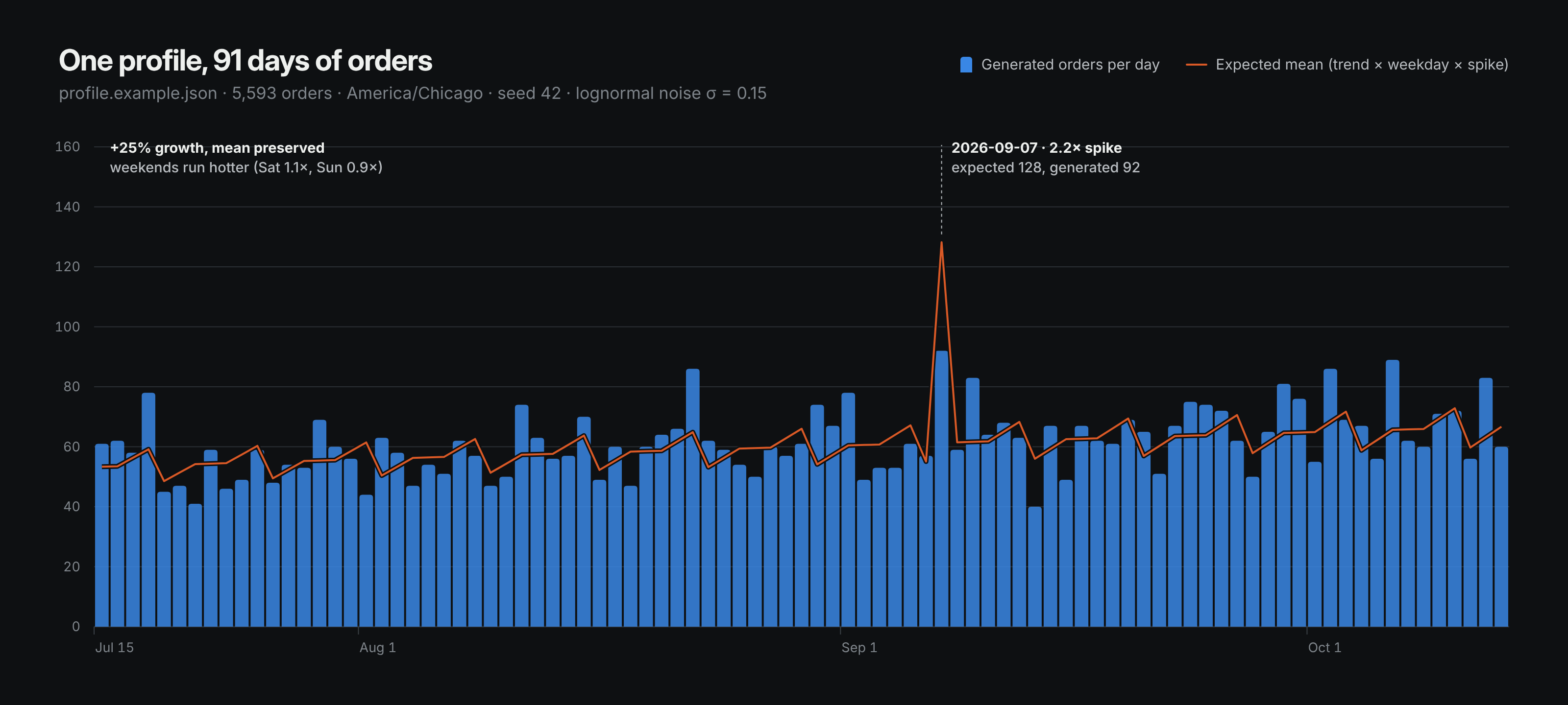
Use a <picture> with a dark <source>, as the README does. On the site the hook swaps it for two images that follow the toggle.
<picture>
  <source media="(prefers-color-scheme: dark)" srcset="assets/volume-dark.png">
  <img alt="Daily orders" src="assets/volume-light.png" width="100%">
</picture>